Der SPIEGEL canteen
Hamburg, Germany
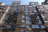
In October 2011 the SPIEGEL Group, whose stable includes Germany’s most important news magazine Der SPIEGEL, moved into its new publishing house in Hamburg’s HafenCity development. This impressive structure on the Eriscusspitze, lapped by the waters of the River Elbe, was designed by Danish architect Henning Larsen. Ippolito Fleitz Group was commissioned to create a new employees’ canteen for the building. The legacy building’s famous canteen was designed in 1969 by Verner Panton and has since been placed under heritage protection. This inheritance represented a particular challenge.
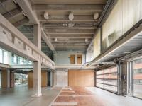
Our deliberations began with a question: could we integrate Verner Panton’s iconic facility into a new concept? After careful consideration we decided against adopting the facility. One factor which spoke against redeployment was the polygonal format of the new building, where Panton’s square-based modular concept would inevitably lead to virtually uncontrollable spatial remnants. Furthermore, the new building offers little in the way of large, continuous walls which are crucial to the Panton concept. The old building had three separate, compact spaces which Panton enlivened with the dynamic forms and colours of his ceiling topography. The new space, however, covers a large area and gives a strong horizontal impression. But above all it seemed logical to us to complement the new architecture of the building with contemporary, future-oriented interior design – exactly what Panton’s facility once was for the previous building.
The employees’ canteen was and is a calling card of the SPIEGEL Group, reflecting its journalistic philosophy as much as its culture of dialogue – not least because of its prominent position in the building and its high visibility from the exterior. Nonetheless it is a space which looks inward, only accessible to SPIEGEL employees and their guests. That means it isn’t a “brand space” as such. The starting point for our deliberations was the characteristics of the space and of the building. The building distinguishes itself through its exposed position on the water and its modern architecture, expressed in the vertical interior space of the 14-storey atrium. The floor plan of the canteen defines a large, polygonal space whose strong horizontal emphasis is further highlighted by the uninterrupted row of windows on two sides.
Because the space had to be flexible, it was soon clear that the ceiling design would be the distinguishing moment of the canteen. Reflecting both this fact and the harbour location, we developed a matt shimmering ceiling which reflects light in much the same manner as water. It is formed of 4,230 circles made of micro-perforated satin-polished aluminium, laminated onto noise-absorbing supporting material and set at slight angles to each other. This means that the canteen’s natural light ambience reacts to its surroundings. During the day the ceiling is enlivened by water and light effects from the surrounding area. The matt shimmering “plates” absorb daylight and turn the roof into a lively, gently reflective complement to the water surface of the Ericusgraben canal. Large-scale light dishes use intense colour to divide the space into zones. This colour generates a positive atmosphere in the space, even on grey days. Dimmable lamps suspended directly above tables ensure that light levels are infinitely variable. In the evening the dishes are transformed into indirectly-lit light objects. The overall mood in the canteen is determined by the warm, white “ambient light” shed by the suspended lamps. Indirect light in selected suspended lamps discreetly illuminates the ceiling discs. Focussed downlights, hidden in the ceiling, complement the nuanced sophistication of the overall mood with light accents. Wallwashers integrated into the ceiling cast an even light on wall surfaces. They create a balance between horizontal and vertical illumination and optimise the sense of space by night, partly through reflections in glass surfaces.
The ceiling also has functional advantages: the area above the ceiling plates is painted black, along with the mandatory technical fittings, rendering them invisible. Ceiling diffusers and sprinklers effectively disappear. In addition, the upper ceiling was configured to be noise-absorbent, complementing the acoustic properties of the micro-perforated plates.
Despite the size of the space the visitor should never have an impression of monotonous, interchangeable, production-line construction. Rather the goal is to illustrate, in a dining context, the culture of dialogue which has flourished over the decades at SPIEGEL. The employees’ canteen is a meeting place, a place of culture and informal exchange of opinions. At the same time it should fulfil functional obligations such as accessibility and spatial clarity.
The round, communicative tables are made from black coated steel frames which seem to grow from the floor in a graceful motion. Granite plates serve as table tops, their lasered surfaces working with the ceiling lights to create glare-free, brilliant light. The tables are placed within the space in three large groups in loose arrangements and so provide an organic counterpoint to the polygonal floor plan. Movement zones are thus clearly delineated. Three lines are set into the smooth, white terrazzo floor: they ensure tables don’t encroach on walkways. Along these lines four areas are arranged with removable, lightweight spatial filters composed of white, hanging rods. Large yellow light dishes support the zoning of the space just as the hanging lamps locate tables within the space.
Wood panelling lends a sense of depth to structural hubs. The whitewashed, varnished surfaces appear even deeper thanks to a vertical, wavy relief which gives a textile-like effect.
Through a zigzagging glass façade a separate area can be formed at one end for discrete events or for use of the canteen late at night. A shoal of bright, hanging Plexiglas rods creates glare-free illumination and an intimate setting. The glass façade between this area and the canteen is formed of doubly reflective glass. So at times when both areas are in use, the separation is almost immaterial. However when the canteen is closed and thus darker, the façade appears half-mirrored, half-transparent.
The employees’ canteen in the SPIEGEL Group’s new headquarters is a space that meets all functional demands while creating a strong visual impact to form a truly distinguishing space. In so doing it supports the mature culture of communication within the company and in a grand gesture transmits these values to the outside world.
Client
Verlagsgruppe Der SPIEGEL
Size
525 sqm
Team
Peter Ippolito, Gunter Fleitz, Tilla Goldberg, Christian Kirschenmann, Tim Lessmann, Alexander Fehre, Christine Ackermann, Roger Gasperlin, Katja Heinemann
Lighting Design
pfarré lighting design
- Interior Designers
- Ippolito Fleitz Group – Identity Architects
- Location
- Ericusspitze 1, 20457 Hamburg, Germany
- Year
- 2011


