Dingshi Logistics Office Building — A compound features courtyards filled with light and shadows
Tangshan, China
Dingshi Logistics Office Building
— A compound features courtyards filled with light and shadows
The project is an office building of a logistics company, located in an industrial park on the outskirts of a city in Northern China. The industrial park occupies a plain and expansive land area, which is adjacent to an urban road on the north and next to an unexploited urban land on the south. The office building was planned to sit at the middle of the industrial park, with pine trees, lawns and footpaths forming gardens on its north and west sides, while on the south side is a wide front court and a parking lot.
The architecture is 85 meters long and 50 meters wide, stretching in east-west direction on a site of about 8,000 square meters. Considering the site is relatively large, ARCHSTUDIO planned the layout of architectural spaces by incorporating courtyards, and created various indoor and outdoor scenes based on functional needs and circulation routes, thereby produced a light-filled, green and vigorous working environment.
I. Horizontal space
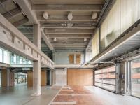
The office building consists of two floors, which present totally different visual impressions. 1F is enclosed and inward-facing, while 2F is open and outward-facing. Such contrast highlights the horizontal layout of the overall architectural space. The building has a "floating" rooftop, a solid pedestal and a transparent space in between, which is similar to the image of traditional architectures to some extent. Several two-storey-high courtyards separate 1F into three parallel horizontal functional blocks. In this way, each room on 1F is connected with a courtyard, ensuring ample daylight and forming diversified landscape. Besides, the block on the south itself includes some small-scale courtyards. 2F has a large area of glass curtain walls, which mark off various functional spaces of different scales and also enable indoor activities to be extended to outdoor terraces freely. Six bridges link the three functional blocks of the building, generating efficient circulation routes and further dividing off several inward-facing yards.
II. Play of light and shadows
The entire architecture is covered by a 4,000-square-meter flat roof and sun-shading grilles formed by aluminum strips. The grilles draw on the linear forms of surrounding farmland, and soften floor slabs. From the building's middle area to east and west sides, the interspace between aluminum strips gradually decreases. Besides, each aluminum strip features width variations and perforated surfaces. The steel-structured rooftop of the three architectural blocks and the sun-shading grilles together constitute an integrated large roof. It looks like a lampshade with interspaces, which allows light to filter down, and thereby turning the building and courtyard beneath into a "forest" of light and shadows. The varying light brings changes to spaces throughout the day. The rhythmic interplay of light and shadows, as well as human activities, together produce distinctive vivid scenes.
III. Multifunctional compound
Focusing on the basic characteristics of office buildings and combining indoor and outdoor scenes, ARCHSTUDIO created a multifunctional working and living compound. The double-height reception lobby faces the front court, which presents a striking first impression, with courtyards and trees unfolding at its back. 1F is composed of various working spaces, including small and medium-sized offices, an open working area and a conference room that face courtyards, a multifunction hall that can accommodate 300 people, a finance office, and a settlement office, etc. Working areas of different departments are separated, so as to avoid interference. At the junctions of circulation routes, some leisure areas were set, such as a cafe which faces a courtyard with a tree, with a view to enabling people to communicate or take a break in a relaxing way. Three indoor staircases and two outdoor stair cases lead to 2F, the design of which fully took into account efficiency and smoothness of routes. The space organization on 2F is more flexible, which contains several large offices, an expansive conference room, a multimedia room, a reading area, a fitness room, the staff canteen, etc. The transparent glass walls closely connect each room to outside terraces and roof gardens, and integrate interior and outdoor spaces into a whole.
IV. Natural construction
The office building is characterized by a restrained material palette, which focuses on the logic relationship between materials and space, integration between interiors and exteriors, as well as maximum expression of material languages. The front court, external walls of 1F, and part of the floor on 2F, are clad in red bricks, a type of material commonly seen on local historical architectures. From south to north, the red bricks together present an undulating image based on the architectural form. According to positions, space openings and functional requirements, bricks were laid in different ways, and hence presenting various formations and visual effects. Apart from bricks, steel materials were also repeatedly utilized, which can be found on indoor and outdoor bridges, staircases, door and window frames, and some counter surfaces within the space. Besides, work was done to endow part of the outdoor floor with slip-resistant quality. On 2F, perforated aluminum grilles were used as ceilings of interior spaces and covers of outside areas. Those grilles hide pipes and wires of lighting system, air conditioning and other equipment, which ensures the integrity of spatial interfaces and forms contrast with rough brick surfaces as well.
Project name: Dingshi Logistics Office Building
Location: Tangshan, Hebei, China
Site area: 8,087 m2
Construction area: 4,617 m2
Main materials: brick, glass, aluminum panel, terrazzo
Design phase: March 2017 — June 2017
Construction phase: March 2018 — March 2019
Design firm: ARCHSTUDIO (www.archstudio.cn)
Chief designer: Han Wenqiang
Architectural design: Jiang Zhao, Hu Bo, Kuai Xinyu, Zhang Yong (structure), Zheng Baowei, Yu Yan, Wang Fu (MEP)
Interior & landscape design: Jiang Zhao, Hu Bo, Zhu Yawei, Huang Tao
Coordinating design firm: Fengrun Architecture Practice
Photography: Wang Ning
Text: Han Wenqiang


