Lecture Building University of Applied Science
Osnabrück, Germany
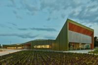
The master plan for the 'Hochschulcampus Osnabrück' (college campus Osnabrück, Germany) is the framework which includes the first building blocks (library, Forum, university building, campus and mensa). The centrally located university building is situated where in the future the campus area and the Forum will meet. Because of this location and the position of the university building as "link", the building is shaped like a volume of three floors with a cutaway at the bottom. The incision ensures a strong relationship with the outside area and gives the university building a clear, recognizable entrance: a striking building is created. In addition, the campus is enriched with a carefully designed outside area, which can be used for events and conferences.
Clear, simple, compact – Upon entering the building (under the cantilevered section of the building) the hall opens upwards: open space along all floors creates a feeling of generous spaciousness. The glass roof allows natural light to flow through the entire lobby. This space can be used by the university, but can also be used for non-university events. The central atrium and green courtyard are special areas in the tightly organized building volume, which can be experienced in different ways and provide simple and clear orientation for visitors.
The layout (as three adjacent sections) leads to a clear, simple and compact floor plan of the university building. Classrooms and emergency staircases are situated on both sides of the building; in the middle part are the lobby, technical rooms and courtyard. The large lecture halls are perpendicular to the main direction of the building, and get their natural light from the courtyard. Due to the existing topography, the heights of the land is used in the new building, making it clear and simple to create the requested higher ceilings in the lecture halls.
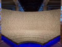
Learning Landscape – The heart of the new university building is formed by the so-called learning landscape. The building interacts with the area outside where campus and Forum connect. In a way, the Forum is continued inside the building, in a ‘landscape’ consisting of various levels and platforms. The learning landscape becomes the central place to meet, connect, communicate, study and exchange information. The spatial quality and striking cutaway give the learning landscape the potential to become a unique spot on campus, with its own very distinct identity. Free 'learning zones' will become increasingly important in education. After all, nowadays digital information is always available everywhere: laptops and tablets are mobile, constantly accessible sources of knowledge. People using these media can connect and form flexible groups anywhere and anytime. The question is to what extent the conventional layout of a university building still meets the requirements of these new behavioural patterns. Perhaps spaces with a flexible layout are a necessary complement to the traditional lecture halls. These considerations are the basis for the development of the learning landscape in the new university building. In this 'landscape' all floors are connected. Plateaus of different width, with parquet flooring of smoked oak, create in the common areas. Tables and objects to sit on start at one and end on another platform, so that the different levels are 'stapled' to each other. The tables and sit-objects offer users different ways to work and study. Loose furniture such as bean bags and seating cubes invite users to create their own setups, depending on need. Particular attention is paid to the acoustics and the function of light in the building: sound-absorbing materials and integrated lighting elements ensure a pleasant atmosphere.
Façade – The rigid structure of the facade with a grid pattern of 1.25m, is made more light and airy by using windows of different heights. Due to the arrangement of these differently shaped windows, the size and shape of the various internal spaces can also be read on the outside of the building. In the interior the different functions can be seen by the varying height of the balustrades. The outer shell is designed as a two-tier structure: the building volume is coated with an insulating green foil membrane that protects the façade against wind and rain. On an aluminium sub-structure, a coating of folded panels - on the sides perforated aluminium panels - are mounted. The perforation of the metal skin creates a varied, lively view of the facade: you can see glimpses of the green building shine behind the metal. The anodized aluminium panels have a soft, almost velvety surface and give the building an important, yet friendly and inviting appearance. The incisions are placed in such a way that the windows and frames are hidden from sight. The principle of these precise incisions is continued in the upper and lower part of the building; the plinth and cornice aren’t visible. The blinds are integrated into the insulating surface and are hardly noticeable behind the metal coating.
Green – The colour green refers to the ‘origin’ of the university, which has its roots in the Faculties of Agricultural Sciences and Landscape Architecture of the former agricultural college. This fresh, stimulating and inspiring colour gives beautiful, striking and contrasting accents to a building which is mostly characterized by the use of restrained colours and materials.
Visual communication – For way-finding in the new building an original typographic has been developed. Quotes and printed collections of words on the walls are there to inspire and arouse curiosity. All these graphics elements are presented in the colour green. The same typography is used on glass walls and doors, as a contrast marker for the visually impaired.
- Architects
- CROSS Architecture
- Location
- Barbarastraße 21, 49076 Osnabrück, Germany
- Year
- 2014
- Client
- Stiftung Fachhochschule Osnabrück
- Architect
- Architect: CROSS Architecture / Benthem Crouwel GmbH
- Project team
- M. Sporer, A. Gerlach, S. Vijgen, C. Wens
- Building services
- IQ Haustechnik
- Structural engineering/fire protection
- Kempen & Krause Ingenieu
- Sound protection/room acoustics
- Kempen & Krause Ingenieure GmbH
- Building physics
- ENAKON + Büro für Building physics, Hannover
- Lighting design
- www.lichtwerke.com
- Outdoor facilities
- www.luetzow7.de
- Gross floor area
- approx. 8,300 m²
- Competition
- August 2010


