GIVENCHY Flagship Store
Seul , South Korea

A building covered by a skin of dark coloured sheets of steel that changes with the light and rests on a glazed base revealing minimalist-style interiors: the new Givenchy Flagship Store in Seoul is a dynamic structure generating varying optical effects. Designed by Piuarch in partnership with the cerative director of the French fashion house, Riccardo Tisci, the new Givenchy space is located in the prestigious Cheongdam ward of Gangnamgu shopping and fashion district of Seoul.
The fashion’s house store is built over four levels accommodating the various collections. It features simple geometric forms: a cube-shaped structure resting on all-glass ground floor.
The structure is clad with electropolished steel sheets. Its surface features some highly distinctive sculptural traits: undulating, sinuous sheet metal perforated in a regular pattern. As the surrounding landscape changes throughout the day, the skin covering the building in a distinctive dark-coloured shade reflects and deform the light, so that the architecture is perceived in different ways.
The ashlar-work on its surface alludes to Givenchy’s research and experimentation with fabrics and Italian art from the 1960s: optical art is embodied in the rounded metal cladding sheets. The kinetic façade – with an oil-slick geometric graphic structure – turns into an urban landmark due to the cut at the top of the structure: its edge opens up to form a T-shape made of satin brass. This architectural feature evokes Givenchy’s trademark T cut: the structure’s shimmering, shiny skin (evoking the fabrics in its latest collections) opens up in the shape of the brand’s symbolic leitmotif.
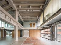
The building, which is covered on the outside by a “soft and precious garment”, features minimalist-style, geometric spaces on the inside. A careful study into materials played a key part in the design of the interiors, selecting unusual stones with different chromatic features: white Calacatta marble with grey-coloured veining and brighter coloured basalt stone.


- Arquitectos
- Piuarch
- Localização
- Cheongdam Dong, Seul , South Korea
- Ano
- 2014
- Cliente
- Givenchy Group
- Equipa
- Cristina Castelli, Viktors Catanovs, Erica Cazzaniga, Marco Dragoni, Davide Fascione, Niccolò Genesio, Gianluca Iannotta, Olga labetskaya, Alessandro Laner, Andrès Mahdjoubian, Miguel Pallares, Paola Sarcoli, Jenny Spagnoletti, Sarah Trianni, Enrico Venturini, Anna Zauli


